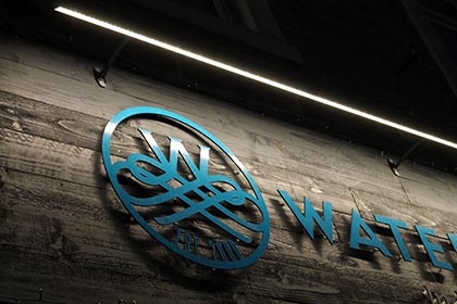
Retro Signage Revival: Why Vintage Styles Are Back
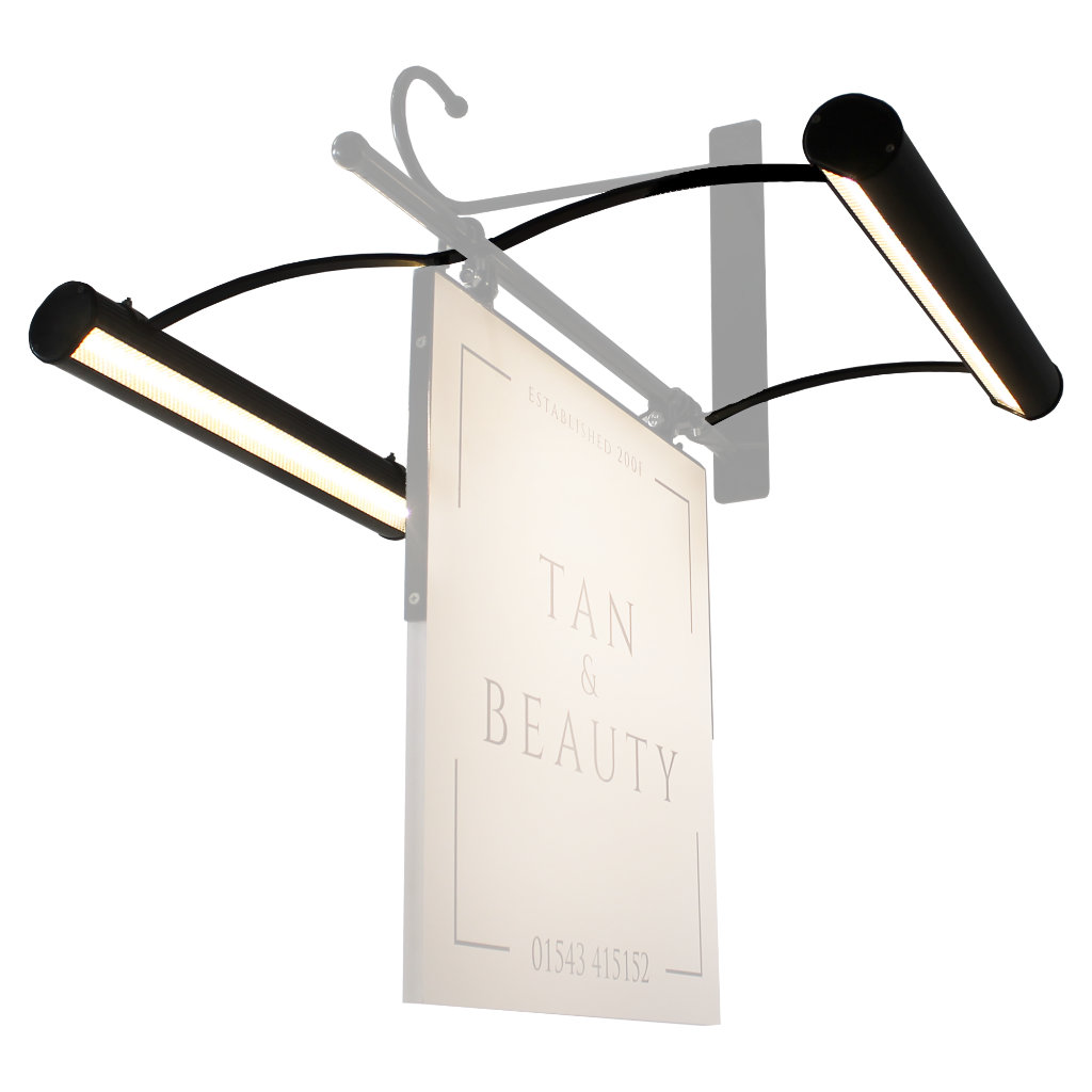
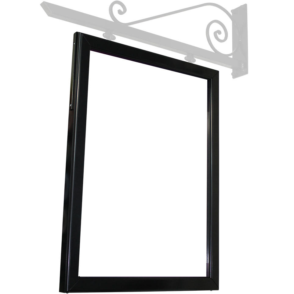
From neon glows to hand painted shopfronts, retro signage is having a moment and it’s more than just nostalgia. Across high streets, exhibitions and online storefronts, vintage inspired signs are making a bold comeback, blending timeless charm with modern craftsmanship. For trade professionals, designers and installers, this revival isn’t just aesthetic, it’s an opportunity to reconnect with tactile design, showcase technical skill and offer your customers something truly memorable.
Why Retro Signage Resonates Today
For many of us, retro signage taps into a collective memory, a time when signs were crafted, not churned out. Here’s why it is striking a chord:
-
Authenticity: Vintage styles evoke trust and heritage, ideal for brands wanting to stand out in a sea of slick minimalism.
-
Craftsmanship: From gilded glass to enamel panels, retro signs celebrate the maker’s touch a perfect match for trade audiences who value quality.
-
Visual Impact: Bold typography, vibrant colours, and layered textures make retro signs pop.
-
Storytelling: Each sign tells a tale, whether it’s a ghost sign from the 1950s or a faux vintage panel made last week.
Whether you’re designing for a café, a workshop, or a trade show booth, here are the vintage styles turning heads:
| Style | Characteristics | Ideal For |
|---|---|---|
| Mid Century Modern | Clean lines, atomic motifs, pastel palettes | Retro diners, lifestyle brands |
| Art Deco | Geometric shapes, metallic finishes, symmetry | Luxury retail, exhibition displays |
| Ghost Signs | Faded paint, layered typography, aged textures | Heritage buildings, urban branding |
| Neon & Faux Neon | Bright tubes, cursive fonts, glowing effects | Bars, pop ups, youth focused campaigns |
| Hand Painted Script | Brush lettering, flourishes, imperfect charm | Boutique shops, craft shops |
Creating Retro Signage (without a Time Machine)
Recreating vintage signage isn’t about imitation, it’s about interpretation.
1. Start with Typography
Retro fonts are the backbone of vintage signage. Look for:
-
Slab serifs (e.g. Clarendon, Rockwell)
-
Script fonts with brushstroke flair
-
Condensed sans serifs for industrial vibes
Tip: Mix fonts sparingly, vintage signs often used one or two styles max.
2. Layer Your Materials
Combine textures for depth:
-
Faux rust or patina for aged effect
-
Acrylic with edge lighting for neon mimicry
3. Use Colour with Confidence
Retro palettes are bold but balanced:
-
Mustard yellow, teal, cherry red, mint green
-
Black and gold for Art Deco elegance
-
Weathered whites and greys for ghost sign realism
4. Add Dimensionality
Vintage signs often had raised lettering, drop shadows, or layered panels. Use:
-
CNC flat cut lettering with or without stand off locators
-
Routed panels to add interest
-
Offset mounts for shadow play
5. Finish with Flair
Details matter:
-
Rivets, screws and visible fixings add authenticity
-
Faux brush strokes or grain textures elevate flat prints
-
Retro-style lighting (filament bulbs, faux neon) completes the look
Further Reading & Visual Inspiration
To dive deeper into the world of retro signage, here are some standout resources:
-
Vintage Advertising Signs - A Journey Back in Time. A great overview of how vintage signs enhance business spaces.
-
Vintage Painting Style: Fonts & Design Tips. Explore timeless fonts and painting techniques.
- Instagram hashtags like #ghostsigns, #vintagesignage, and #signpainters — A goldmine of inspiration and real world examples.
- Books like Sign Painters by Faythe Levine & Sam Macon — A tribute to the craft and its modern revival.
Whether you’re designing for a nostalgic brand or just want to inject some personality into your next install, retro signage offers a rich palette of possibilities. And with the right mix of materials, fonts, and finishes, you can create something that feels timeless — yet totally fresh.


