The Psychology of Colour in Signage
How Colour Choices Shape Visibility and Perception
In the world of signage, colour is far more than a design choice, it’s a strategic tool. Whether you're guiding foot traffic, branding a storefront or promoting a product, the colours you choose can make or break the message. But what makes colour so powerful in signage?
Let’s dive into the psychology behind colour and how it influences visibility, perception and emotional impact.
Visibility: Colour Contrast and Readability
Visibility is the first hurdle any sign must clear. If people can’t see it, they can’t respond to it.
- High contrast = high visibility. Black text on a white background is the gold standard for readability. Similarly, white or yellow text on a dark background (like navy or black) grabs attention from a distance.
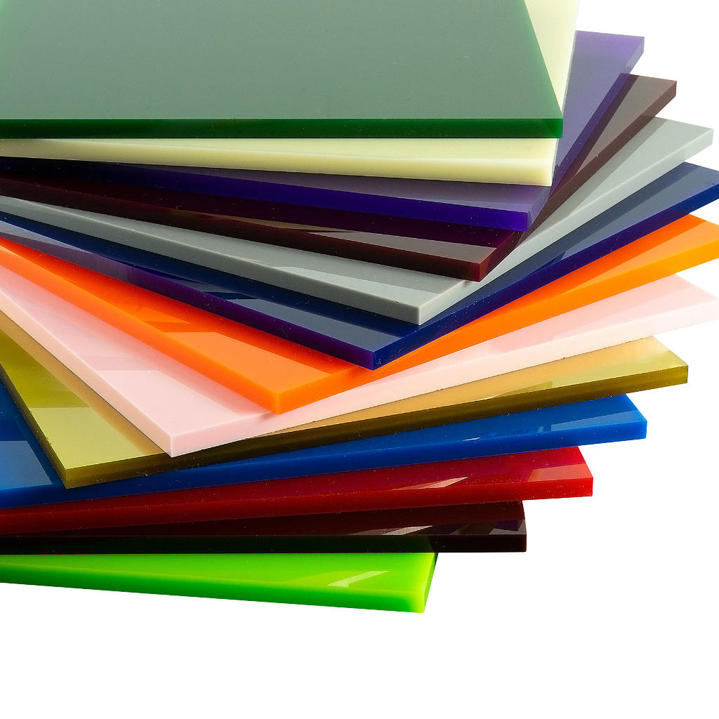
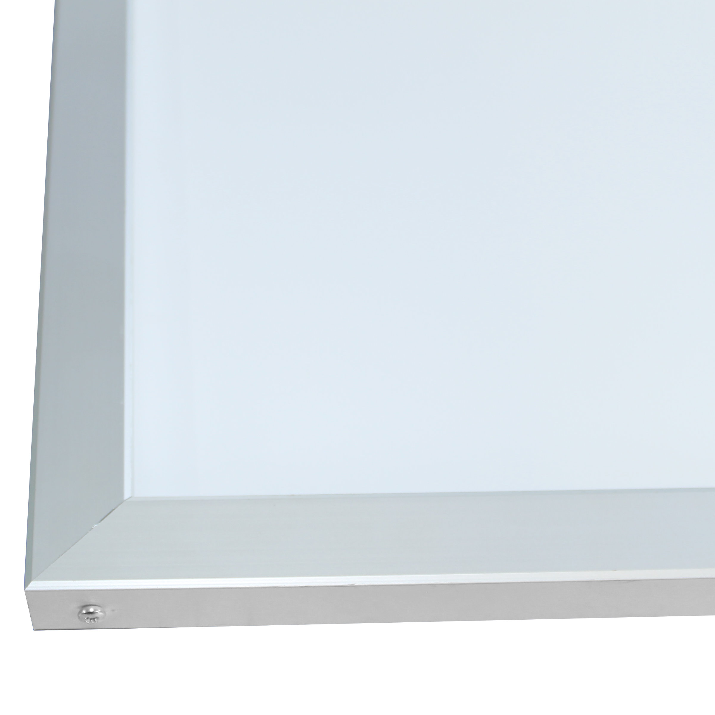
- Illuminated signs amplify colour impact. LED light boxes generally feature opal acrylic panels, these help enhance colour vibrancy and contrast, especially in low light conditions.
- Environmental context matters. A green sign in a leafy park may blend in, while the same green in a high street will generally stand out. Always consider the surroundings when choosing colours.
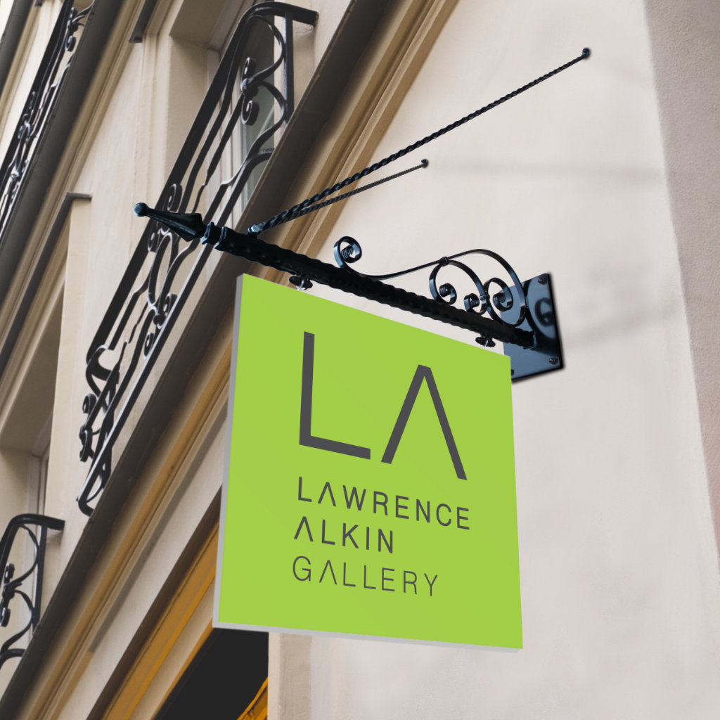
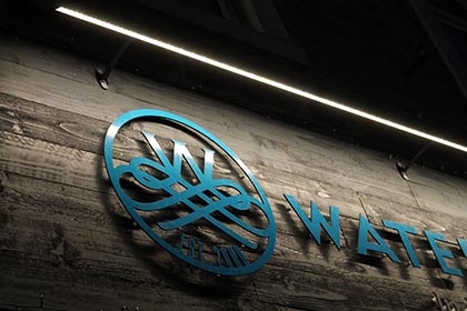
Bright green sign that stands out against the stonework
of the building
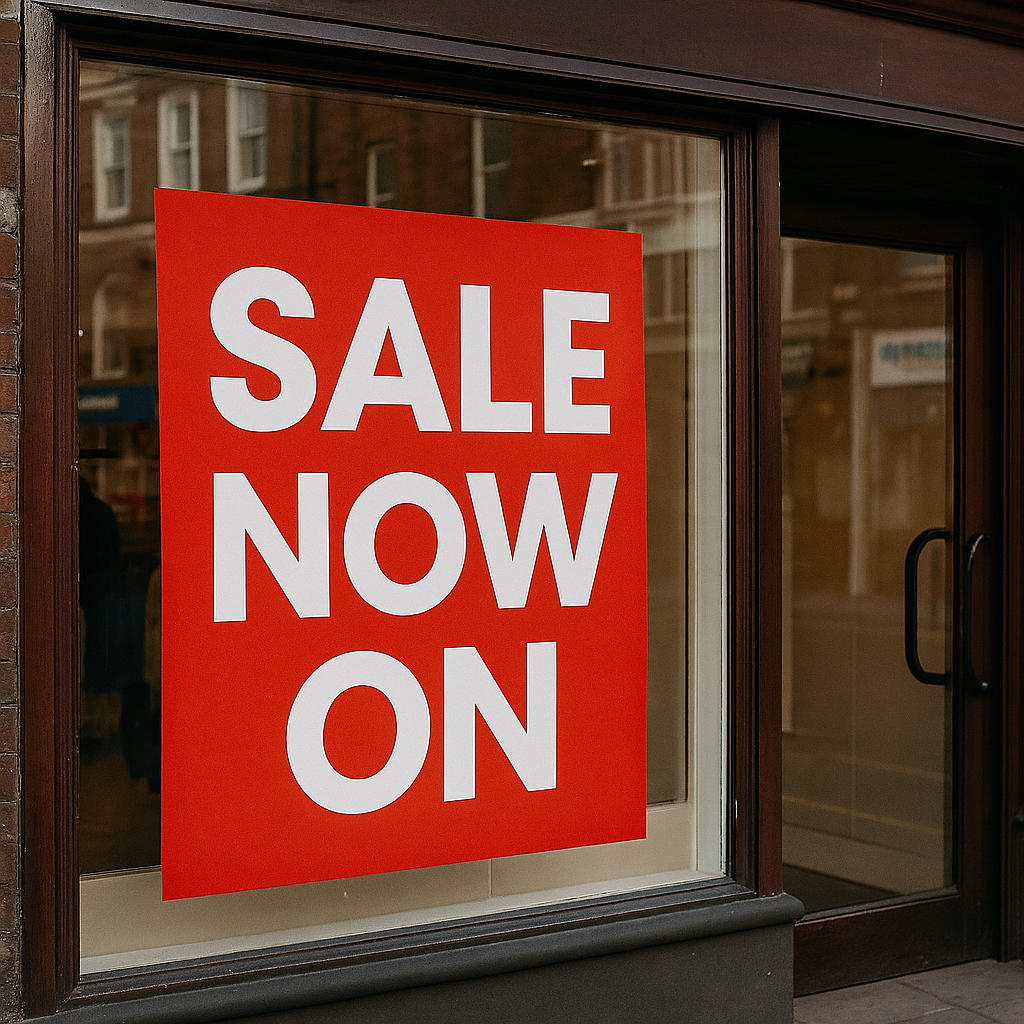
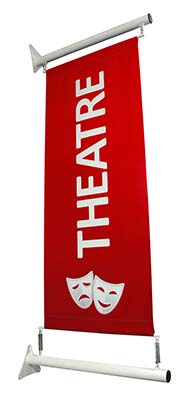
Red sale signage gives a sense of excitement.
Perception: What Colours Say Without Words
Colours evoke emotions and associations, often subconsciously. Here’s how common colours are perceived in signage:
|
Colour |
Psychological Impact |
Common Uses |
|
🔴 Red |
Urgency, excitement, danger |
Sales, warnings, fast food |
|
🟡 Yellow |
Optimism, attention, caution |
Promotions, road signs |
|
🔵 Blue |
Trust, calm, professionalism |
Corporate, healthcare |
|
🟢 Green |
Nature, safety, growth |
Eco friendly, pharmacies |
|
⚫ Black |
Luxury, authority, sophistication |
High end brands, formal signage |
|
⚪ White |
Cleanliness, simplicity, purity |
Medical, minimalist design |
These associations aren’t universal, but they’re commonly found in the UK high streets and beyond. For example, red is often used in retail signage to signal urgency, such as in sale promotions.
Directional and Informational Signage
Colour also plays a critical role in way finding and informational signage:
- Standardisation aids recognition. Red for stop, green for go, blue for information, these conventions help people process signs quickly.
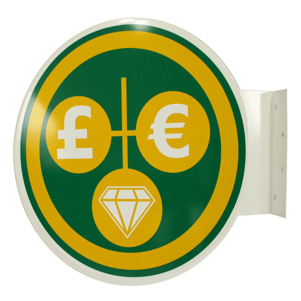
- Speciality brackets, such as our barber's pole or pawnbroker balls, use iconic colour schemes to signal business type instantly.
- Café barriers and banners, available to customise, they can guide queues or designate areas while reinforcing brand identity.
Cognitive Load and Colour Simplicity
Too many colours can overwhelm. The brain processes visuals faster when the design is simple and the colour palette is limited.
- Stick to 2 or 3 dominant colours. This keeps the message clear and avoids visual clutter.
- Use colour hierarchy. Make the most important information (e.g. SALE) the most visually dominant through colour and size.

The barber's pole is instantly recognisable

Traditional Signwriting
Image credit: Paul Bank Signs
Case Studies and Industry Insights
Sign writing, a craft celebrated in our blog earlier this year, also relies heavily on colour psychology. Traditional sign writing often choose colours based on historical associations and legibility, blending artistry with function.
Material Matters: How Colour Interacts with Surface
Colour behaves differently depending on the material:
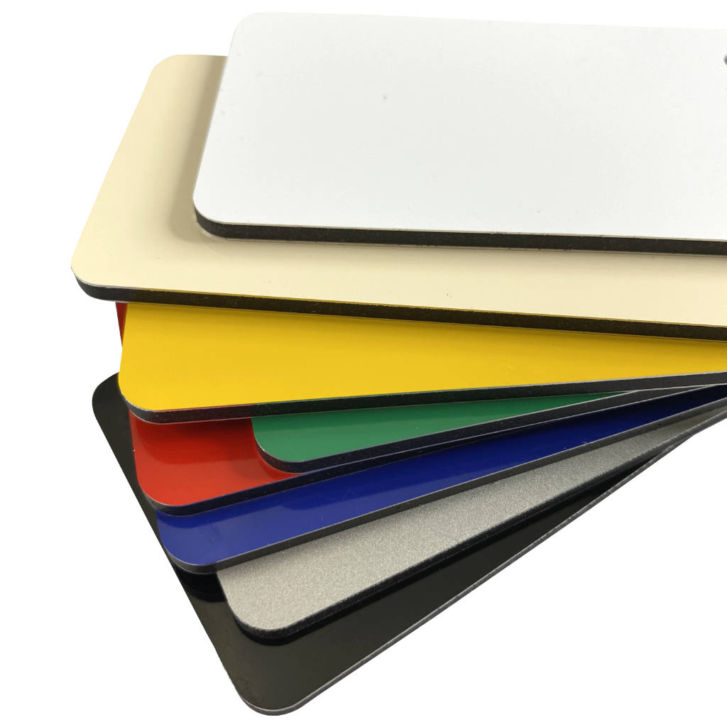
- Glossy surfaces reflect light, making colours appear more vibrant but potentially harder to read in direct sunlight.
- Matte finishes reduce glare, improving readability.
Branding and Emotional Connection
Colour is a cornerstone of brand identity. Think McDonald’s red and yellow or Facebook’s blue.
- Consistency builds recognition. Use the same colours across signage, packaging, and digital platforms.
- Emotional resonance drives loyalty. A calming blue might attract healthcare clients, while a bold red could energise a retail space.
Accessibility and Inclusivity
Colour choices should also consider accessibility:
- Colour blindness affects 1 in 12 men and 1 in 200 women. Avoid relying solely on colour to convey meaning, use shapes, icons, and text as well.
- High contrast benefits everyone. Especially in public signage, where quick comprehension is key.
Final Thoughts: Colour as Strategy
In signage, colour isn’t just aesthetic it’s strategic. It guides eyes, evokes emotions and reinforces identity. At Tradesignz, we understand that every bracket, panel and illuminated box is a canvas for communication. Whether you're choosing a bold red for urgency or a calming green for trust, your colour choices shape how your message is received.
So next time you design a sign, ask not just what looks good, but what feels right.
If you’re looking to customise your signage with colour that speaks volumes, explore our full range of brackets, panels and illuminated boxes on our website.

